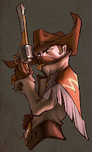
These are the notes I took from Kekai's demo at the Gnomon Live Workshop. I recommend all the people to go next year, I learned a lot. I'm trying to translate them into normal speak the best that I can, so I apologize if they're hard to understand.
*disclaimer: He didn't say most of this, it's just a summary of my personal revelations.
It's all about values.
Start with big brushes, and put most of your brush strokes in areas of focus. You don't need that much anywhere else.
Smudge shit together.
It's all about finding cool shapes. Have your own library of details and designs that you can pull out on any piece to add that little bit of coolness.
Minimal colour. Add it later.
When in doubt, do a portfolio piece. Don't explore at work.
Always be aware of your strokes. There's a lot that goes into every stroke.
Turn on scatter for your smudge tool in the brush presets.
Transform ->Warp gradients
To add dynamism, draw your figures like athletes. They're in the middle of action and always off balance.
Learn how to draw horses, and riders.
Be a curious human and act on your curiosity.
Develop your shapes by building up your brush strokes. Choose what to exaggerate and what to play down. Keep in mind the flows and ratios. Choose your implied lines and commit to them. In the end, it's all about making cool shapes.
Getting faster is about skipping steps and doing several different things with as few brushstrokes as possible. Decide what the important shit is, and "merge down" your process.
Modify your overlay or colour layers with colour balance. Easier than doing gradient maps.
Pure black adds more punch and contrast. Makes your illustrations more impressive from afar.
In brush presets, check the texture box, but make sure your texture is in "subtract" mode.
Filter - Polar coordinates. Makes shit round.
When you know an idea is good, but nobody else can see what's good about it, draw it again. If they still can't see it, draw it until they do. You will probably come up with your best ideas that way.
When your eye flows around the image, it should be like Morse code: _._._._. (dots are details and underscores are areas of rest)
Concentrate your effort on the focal points only. You actually don't need to render everything else.
Build up the design of your focal points organically, the same way you do values, colour balance, detail spread etc. Your design should get more refined as it approaches areas of focus, and more loose as it moves away from them.
HOPE THIS HELPS!