Monday, December 23, 2013
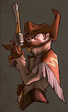
Walter White or Vladimir Lenin
The pain of brushwork that has been haunting me since I started drawing... It all can be solved with painting opaquely!! (and then smudging) Even though Trevor's been telling me to do it for about a year now, it only now dawned on me that the second biggest obstacle between you and a quick render is COLOUR PICKING! (The first one is putting the right mark in the right spot)
And it takes a while to get that colour right, so most people try to blend it on the canvas, which actually takes wayyyy longer.
For most materials you only need to pick 3 or 4 different colours, the rest is blending. So invest that time to pick the right ones upfront!!!
Trying Borislav's brush technique to improve form rendering and facial structure. Learned a lot. Still more to go.
Sunday, July 28, 2013
Cot!
First maester study in a looooooong time.. I failed at the values, which I realized 2 hours into it.
Needless to say, learned a lot. Should probably stick to grayscale for now..
Remember when switching local value, that your values for lights and shadows will switch also, and grow proportionally to the amount of local value shift.
Needless to say, learned a lot. Should probably stick to grayscale for now..
Remember when switching local value, that your values for lights and shadows will switch also, and grow proportionally to the amount of local value shift.
Sunday, June 30, 2013
Yin and Yang qi
Slowly foraying into materials and colour rendering. Decided to start by copying this master. And doing a little doodle to see what I learned.
The OG
Start with rough grayscale, low contrast. Clipping mask --> add your hues to the shadows. Work mostly in the low saturated tones and limit it to 3-4 main hues for the shadows. Then find your saturated spots and put em in. Then find your highest values and put them in. Continue until done.
Always unify and desaturate all your colours because thats how photoshop works best. You can paint saturation and brighten up the value later.
Shapes are usually highlighted by occlusion shadow around them.
Keep your colours as simple and unified as possible, because anything you pick will blend differently with the thing underneath it. Also, if you keep your hues subtle, you won't need as much to describe variation. Bright colours require more brushstrokes.
Also, you can reuse the hues on your canvas for different materials..... Interesting.
Split it up by planes. Any form you put down, find the terminator and rough it in (with gradients if you can).
Only put down form strokes when you need to. When you can leave it as is, leave it as is. If you don't "feel" the form, then add more.
Imagine that you're actually looking at it. In real life. Think about where the rays are going, what they're bouncing off of.
The OG
Start with rough grayscale, low contrast. Clipping mask --> add your hues to the shadows. Work mostly in the low saturated tones and limit it to 3-4 main hues for the shadows. Then find your saturated spots and put em in. Then find your highest values and put them in. Continue until done.
Always unify and desaturate all your colours because thats how photoshop works best. You can paint saturation and brighten up the value later.
Shapes are usually highlighted by occlusion shadow around them.
Keep your colours as simple and unified as possible, because anything you pick will blend differently with the thing underneath it. Also, if you keep your hues subtle, you won't need as much to describe variation. Bright colours require more brushstrokes.
Also, you can reuse the hues on your canvas for different materials..... Interesting.
Split it up by planes. Any form you put down, find the terminator and rough it in (with gradients if you can).
Only put down form strokes when you need to. When you can leave it as is, leave it as is. If you don't "feel" the form, then add more.
Imagine that you're actually looking at it. In real life. Think about where the rays are going, what they're bouncing off of.
Friday, June 14, 2013
Manatee of Steel
You need to make some important calculations to show form. First, find the planes of the brightest brights. Next, find the planes of the terminator. Next, find the halfway point between the plane of the brightest bright and the plane that faces the camera. Once those planes are there, just measure the speed at which transitions happen between them.
Render form shape by shape. Get the big mass in first, then medium, then small. Start with a flat value (preferably the darkest), then add the brightest bright, then highlight if needed. Oh yeah, don't forget the cast shadow, too! Add ambient occlusion and reflected light, and there you have it!
Scott Robertson says: "form change equals value change" so choose which forms you will render wisely.
Render form shape by shape. Get the big mass in first, then medium, then small. Start with a flat value (preferably the darkest), then add the brightest bright, then highlight if needed. Oh yeah, don't forget the cast shadow, too! Add ambient occlusion and reflected light, and there you have it!
Scott Robertson says: "form change equals value change" so choose which forms you will render wisely.
Tuesday, June 11, 2013
Thursday, June 6, 2013
And I think to myself
that I should get better at form.
New way of painting. Start with ambient occlusion, because a ton of your values and shadows are gonna come from that anyway.
There are two kinds of gradients, one that moves toward you and one that moves away from you. You need a separate brush for both.
Be careful when it comes to subtle value differences. As soon as you enter that territory, your mistakes will cost a lot of time to fix. Make sure your big shapes and values are placed correctly before that happens!!
New way of painting. Start with ambient occlusion, because a ton of your values and shadows are gonna come from that anyway.
Sculpt by Bruno Camara
There are two kinds of gradients, one that moves toward you and one that moves away from you. You need a separate brush for both.
Be careful when it comes to subtle value differences. As soon as you enter that territory, your mistakes will cost a lot of time to fix. Make sure your big shapes and values are placed correctly before that happens!!
Tuesday, June 4, 2013
Allofher Chippers
Stylization class this morning. Courtesy of my friend o-town chipster.
Learned a lot. Pushed limits. Now better. More of this.
Subscribe to:
Posts (Atom)