Tuesday, April 5, 2011

Who do you think you're fooling now?

It's such an ordeal to update this blog/sketchbook, but you know what? Someday, when I'm really good, some kid who's just starting to draw will want to scroll back all the way to now to see how I got to where I will be.

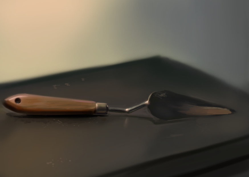
This thing calibrates my Monitaur, but it does a terrible job so I've been putting off making a still life out of it. Unfortunately, I'm running out of interesting objects to draw so there.


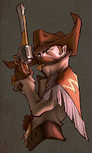
And then I did some fan art for Riot Games. It's their latest champion. That company is going far, because they're actually innovating within the DotA genre, and their business model is very clever. That is, until Valve gets on the scene with DotA 2. Then all those companies (all two of them) are getting hit by a freight train, unless Riot makes some really bold moves.


Some things I learned:

You compose with gradations, not flat colour. Always know where your gradations are going, and how intensely.

The most efficient way to make something better is to erase it. So do that as often as you can manage. Ideally, if you have the time and are willing to 'scrap' hours of work, you should do your illustration 3 times before the deadline. Good product is made by having smarter than average people iterate on an idea more than the competition.

Sometimes seeking shortcuts for processes actually takes longer than doing it the "stupid" way.

Next time you listen to a pop song, in your head replace all the "baby" lyrics with "hitler." It's the way it was meant to be heard.

I'm beginning to understand that more and more things in life depend on what you believe rather than logical analysis. There are many things you couldn't possibly figure out the reason for, so you have to rationalize it with your own belief. Fill in the gap in knowledge, in a way. So what you put in that gap is entirely up to you and sometimes it's very important to your attitude and work output. Please, always believe the most positive thing. If a big shot artist doesn't respond to your e-mail, don't blame the fact that your art isn't good, or that you came on too strong. Analyze what you can, then rationalize it with "he would have loved to answer if he wasn't so busy."

That said, in any past circumstance, there is always a more positive outcome that you could have achieved. You have to question how you could have gotten there, without regretting that you didn't.

I heard that the final boss of Diablo 3 is, in fact, Lady Gaga, and not the lord of terror.

Edges are gestalt psychology at work. When you draw from life, you find out how your brain makes sense of your scene, by analyzing which edges in it seem hard and which seem soft. The fast your eyes skim over the edge as you're looking at the scene, the softer that edge will be in your painting.

When doing something artistic, you gotta genuinely love what you do, so that you get some creativity help from your subconscious. When doing other tasks, like programming, you just have to have a passion for problem solving.

There are really 3 types of edges in digital painting. Hard, soft and textured. You can use a texture brush to softer things, instead of the boring old airbrush.

I also heard that in the Diablo movie the monk will be played by Vin Diesel.

Thursday, March 31, 2011

On Our Last Crusade

Today is a very important day because I failed harder than I have in the recent past, and it was difficult to get over it.
I stopped working on this guy and decided to start on a new one. Where this guy failed:

  • Detail distribution
  • Silhouette read
  • Value read
I've sunk two days into this robot, expected to get a portfolio piece, but had to settle for the knowledge of how much I need to work on vehicles. But out of the bad comes the good, out of the plague came the renaissance, and at some point soon I'm gonna embark on a new challenge that will teach me the ways.

Starcraft struck gold by imitating the Alien with zerg, and adding an exciting horror element into their game, on top of the sci-fi run-of-the-mill conspiracy/rebellion plot lines and themes that go along with the Terran campaign. Protoss are probably the race with the least character, and I was never really invested in what they had to say when I played the campaign, though their visual and gameplay design was solid. Their biggest thematic achievement is probably being the indians to the Terran cowboys. My guess is they were trying too hard to conceptualize a real alien race, which felt too foreign and weird.

Blizzard is the game industry Valhalla. You go there once you have proven your worth in battle.

I realized recently why a few of my pieces were ions beyond anything else I was doing at the time (see the Samurai). It's that "artistic" aspect of concept art shining through, coming from your subconscious. When people are hit with "inspiration" or whatever you want to call it, your brain produces better work, and that's what happened. However there's still no way to logically predict when it will happen again, or how to cause it to do so.

Ideally, all the pieces that go in your portfolio are ones that were made with inspiration.

Oh yeah, I also did some studies hoping they would help me with materials etc. They did. But it didn't save me in the end.

Tuesday, March 29, 2011

Here We Go Again

Time to get back to work. I'm making some robots next. Will probably upload by Sunday.

In concept art, three things guide your decisions when making shapes: appeal, functionality and gameplay implications.

A lot of hard surface and architecture design is about adjusting angles to make straight lines flow in a nice way.

In the same way that you want to distribute polycount and texture space, you want to put your detail on the part that is most exposed to the camera, or position your concept so that the biggest area of importance is seen.

The way you usually tell a professional from a student is by spotting shortcuts in brushwork. A student, while perhaps having the same skill as a professional, will not have had enough experience to simplify his painting process into something efficient and effortless.

When you don't want to design new shapes, guide the eye with dust, scratches and other texture details.

I heard this new rumour that Diablo III is actually set in Mexico.

Sunday, March 20, 2011

Dawn

Got the FIRE BACK YEAH!!!

Been thinking a lot about form in my still lives. Having less and less time to do them these days... How long can I keep it up?

Also, I'm often on the phone with my girlfriend as I do these, so I wonder how that affects their quality. During the last one she read me Sailor Moon lore from the wiki.

Some thoughts I've collected over the past couple of days:

When you are drawing line art, doesn't matter that much how you arrange your shapes, as long as there is a semblance of going big to small. The eye can be guided with line weight.

Size should dictate the amount of detail you put on an object. If it's big, it's usually important.

I think that ideally every company wants their concept artists to produce the quality of work they would produce for themselves (for fun), but do it for the company and before its deadlines.

If you want to become good, you have to modify your process for painting so that you are rewarded appropriately as you paint. In a way, it's like a video game. It's only fun if you have enough success, otherwise you don't want to play anymore. Since making a detailed illustration or concept takes a long time, there must be points in your process where you look at your work, become proud of your progress and get inspired to continue working. For me, there is always a dip that happens at about 40% when your expectations for the painting are underwhelmed by what it actually looks like as you start to refine the sketch.

There is always a positive and a negative way to react to your situation, so ALWAYS react positively. When you are striving towards a goal, you are only harming yourself by letting negativity get into your brain, even if its only for analysis of your situation.

I started taking 5-minute "motivation breaks." When I feel tired, bored or uncomfortable from sitting in one place for a while, I go into the living room and look outside for a couple of minutes. Then I flex my muscles, yell and do whatever it takes to get myself pumped up to go back to work. It works much better than taking breaks by checking your email.

Instant colour scheme tip #1:
- Take your entire image or area with muddy colours and lower the saturation.
- Go into "Color Balance" and raise or lower any colour you want. Boom.

I still haven't figured out a good way to mix colours digitally, because there is no way to preview the colour you find with RGB sliders other than trial and error. Also, PS eats your saturation when you use opacity to blend your colours, which gets in the way of everything. Maybe I should just permanently use my brush on overlay? Gonna try it on my still life tonight.

When you set out on a big project, it's important to lay down some key elements and main goals at the beginning, so that you don't lose track of them as you are working.

If you are using a soft brush, you are limiting your value range, because your capabilities for contrast are limited. This is why it also makes sense to use a soft brush to begin your paintings. However, as you progress through it, you must use a harder-edged brush for the fine value/colour transitions.

Contrary to the unpopular belief, it IS actually about the brushes. The shapes you make, the hardness /softness of edges, and how the brush puts down the colour are all qualities that are essential in achieving a workflow that makes every stroke count.

The MOST IMPORTANT THING I LEARNED: It doesn't matter how good or bad you are objectively. If you can constantly convince yourself that you're just within reach of greatness, you will become objectively great sooner than you think.


Oh yeah, I also think I'm gonna reveal that project I've been talking about. Check it out!


And some thumbs:


Just sent that off to the blizzard guys I met. Hopefully they'll find these worthy of a crit.

Based on the work you see above, things I need to work on are:
- Scale
- Depth in Z-space by the use of colour, saturation, edges and shape. i.e. more scale.
So I gotta get back to work!

Sunday, March 13, 2011

Missing Deadlines

For the past three still lives I've used pretty much completely different methods of starting. First one was an amalgamation of brushes, just getting warmed up. Next, I tried to block everything in with a hard brush and exact colours. Now I tried blocking in with a soft round airbrush and approximate everything, then refine colours, edges, values and drawing as you go along. I think this is the method that saves you the most time in the end. You can leave most of your painting with soft edges and "averaged" colour, but then tighten up the areas of focus, and find a way to guide the eye creatively. The danger here is it's very easy to make the entire painting swim in mud.

I've also been thinking a lot about colour transitions, and trying to make them as efficiently as possible. Highlights, for example, take at least two tones (usually a saturated soft one first, then a dull, bright, hard stroke on top) to pull off. I think ideally you want to simplify the picture down to as few colours as possible, and still retain all the information in the picture. That's where the "skill" comes in.

Saturday, March 12, 2011

A-ha!

Thought I wouldn't post today did you? Well you're WRONG.

This is a lot better than the last "night still life" I did. I think back then i couldn't see green. On this one I tried to achieve a realistic look with the highlights, but failed again. Oh well. Some value areas need a bit of work as well. Now that I see it in thumbnail, mistakes become more apparent. Gotta remember to step back!

Can't wait to see what my paintings will look like when I get back to them!

Friday, March 11, 2011

The Waiting Game


I'm a firm believer in number of updates over having things to say so here.