Monday, January 16, 2012

Felt like Selfing


Haven't updated in way too long. Gotta compile my notes and upload some Riot art. Will do on weekend.

It's really hard to hold your head still for an hour while trying to be precise, so the drawing is off. I was focusing on form though. The value range could have been better.

Sunday, December 18, 2011

Are you ready for the ruff-neck bass?

Man it's been a while, eh? I started extrastilllife to force myself to do personal work on the side, and so far the only sketch that didn't have to do with Riot is this.


Not to worry. This is the beginning of a new era. I've got a ton of Riot work backed up and ready to show, some of which I'll be uploading on DA and cghub. Don't have too much written down these days, because most of it is short enough to fit in a tweet!

Anything you want is just a matter of time. Be patient and opportunities will present themselves.

Everyone loves to be sincerely flattered.

You know your own flaws, but you're afraid to admit them.

Stop yourself from ruminating. Recognize when you're having negative thoughts and get rid of them. The more you think the less you do.

Don't introduce new values into your painting unless you know that all the present ones are in the right place.

It should be more about shapes of value than strokes.

There are things that will fall in your lap, and there are things that you're too young for. Doesn't mean you won't get them ever. Be patient.

Saturday, December 3, 2011

Massive Black Post-Mortem

I came back from the Massive Black Workshop San Francisco about two weeks ago, and at this point it would be offensive to put off writing about it any longer.

Met a ton of awesome artists, learned a lot, grew as an artist and a human being. Thank you everyone for sharing the experience with me.

 Instructors, first day

These notes are mostly for myself so that I don't forget. If you get something out of them, great!

The goal of a concept artist is to save producers' money. They should explore places and characters and visualize them. They create emotions and please people. Give choices.

Don't invest yourself into your work. It's a service for a client.

Be faster and you won't be attached to anything you draw.

Get proficient first, then express yourself.

We're not robots. If you develop the shape language in your head, create custom brushes for it so that you don't have to repeat the shapes by hand.

HRDI gradients give you mood, value range and establish your environment.

Go away from technical art, focus on your shapes and emotions.

Perspective should be second nature. So should form.

Inversion, symmetry, repetition, similarity: Ingredients of a good image.

Creation is taking two ideas and merging them.

Think about all the things your shape could possibly say ahead of time, so that you won't run into the problems with your art director.

You have to awaken inspiration. Do something you're afraid of. When working in a studio, trust one another. Share.

Hard edges give more weight and detail.

Build up colour one at a time. Remember when you have a grayscale image, and you put that first saturated green on, you know have two hues on your canvas, not one.

Leave definition for later. Get the idea across first. Make it read.

Have as many tools as you can to modify and refine elements in your image without changing the structure of the whole.

Don't keep all your eggs in one work basket (idea)

Be genuinely interested in the subject matter.

Work smarter, not harder.

Start with a framework.

Think about when to move up or move to the side when concepting. Side meaning iteration. Up meaning refinement.

Form harmony, detail distribution, readability and silhouette.

Amass a library of reference material.

Put in spaces, holes. Positive/negative space.

Fuzzy to sharp.

Angles of the drawing suggest character.

Matthias's Awesome Presentation, Final Piece

Cast shadows, reflected light etc. are actually all properties of the materials, not light.

A sphere made of tiny chrome spheres.

Z-depth value pass.

Start with a sky.

As you refine the piece change major colours/values that were in your thumbnail to get a fresh eye.

Paint patterns in a separate file, then paste it in.

Paint simple forms (like cubes) for clouds and foliage.

CBB = could be better. Get there asap.

Spend 40 hours on a piece without using 3D. You learn a lot more.

Use something everyone knows as a jumping off point for your concept. Then extrapolate.

The spectrum of iconic/fun vs. realistic.

Very few artists are nice, fast and good. Usually two of those will land you a job.

Make your design smart.

Don't be prejudiced against anything.

Don't have pre-conceived notions about the industry.

Colour dynamics --> hue jitter. Lock that shit.

Use bevel for a layer with chainmail shapes.

Don't go for a character because your execution was good. He/she needs to fit the story.

Always think ahead. Keep moving forward and don't attach yourself to anything you do.

Ultimately, check your gut feeling.

Keep the hierarchy of light sources at the back of your mind while painting.

Teamwork is biting the bullet.

You will never get every idea out of your head in the short span of life.

The more you do it, the more you are it.

Personal work is masturbation.

Do whatever the fuck you want.

Coro still hurts.

Friday, October 21, 2011

Last Vegas Special

I wanna take my blog back to its roots for this one. I recently had the opportunity to join my family in a trip to Last Vegas, so I'm gonna sum up the things I learned and the things I saw the same way I did on my Eurotrip two years ago.


Everyone has something interesting to offer you, whether it's material benefit, insight, or experience so learn how to quickly establish a connection with them.


Breakfast buffet at the Wynn: every kind of your favorite food is here. You don't even want to beat the system by eating more than you paid for. You just want to try everything. A meal is measured in trips instead of courses. Two is the standard, the first being everything you can fit on one plate.

Better genes get you more money, but if you managed to get some without blonde hair and blue eyes, you're in luck. In clubs, money is the the thing most critical to success. Then genes. Doesn't matter how you move or what you say.


Rocks in the sun are all about interesting shadow patterns, and local colour in the lit side.


Nature has similar patterns and detail distribution at all scales. The thing that makes you aware of the scale is most often the curvature of the earth on the horizon.


Rocky environment never just have rocks. In the grand canyon, there's powdery sediment and plants.


Remember transitions. Water = more plants.
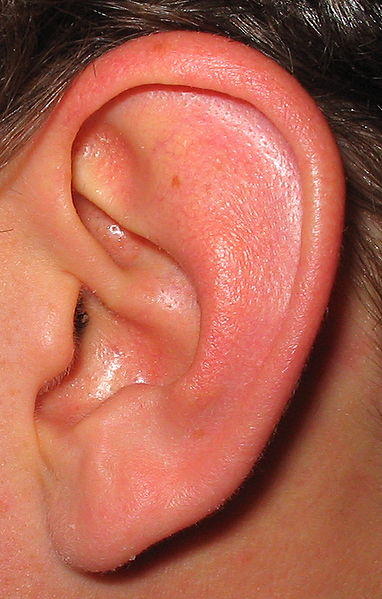
Nature always variates, so should you.


When doing environments, always add some sort of wildlife, unless you want it to be completely man-made and dead. Then add dust, wear and tear etc.

The analytical mind cannot be a performer. In order to act, one must turn off analysis.

Thank God some dudes are shy, otherwise women in clubs would always be swarmed.

It's gonna take me a flight or two back to LA to get used to calling it my home.

Friday, October 14, 2011

Damn I Need to Blog

I got a whole bunch of work backed up now, which means I'm going to start posting more frequently. Maybe I'll get some of my street cred back.

Find a process for isolating elements of reality that leaves the prettiest artifacts. As in, the areas that aren't finished should look finished as quickly as possible. Constant time pressure helps you get better faster, because you begin to get rid of inefficiencies and you prioritize visual information so that the important stuff goes in first.

It's all about the bear necessities. Don't ask how many strokes it will take you, but ask how few. How few colours/values will it take to render a human body? What's important for you? Form? Pigment variation? Gesture? There are many ways to portray reality and none of them are "realistic" so choose to focus on a combination of visual elements that fits your brain.

Analyze the structure of  what you're drawing. That way your drawings will instinctively have more power, and you will learn more about your subject.

In entertainment design you can't stray too far from the zeitgeist. Your audience has to know and get what you're drawing right away.

When taking crits, always say "yes, and ..." If you don't understand, ask why.

Always keep in mind what the most important element in your design/painting is. ALWAYS. Before making any stroke, ask what is the important element.  I can't stress this enough.

Gradients give you more information that flat colours, however it's a lot harder to manage them to describe form.

Concept artists are basically prostitutes. You are hired to draw things without getting attached to any of them. I will probably return to this parallel.

The tighter the gradient, the harder edges you can use on your brush.

I repeat myself a lot, but that's only because these things are important. The easiest way to resist temptation is to give yourself no choice.

Life drawings from last night. 10s, 15, and 20s.


Monday, October 10, 2011

The Math of Design

Didn't get into the Marquee club because I didn't bring a dress shirt to vegas, so decided to blog instead. Fuck that shit anyway, the wait was getting up to an hour.

Yet another tutorial that I will need to do. For now, just analyze the wikipedia page for the Golden Ratio. If you want to learn the rules of design fast, make your distribution of detail, value, saturation and colour should adhere to the golden ratio. Essentially, if the information in your image were to be measured in bytes, as your eye travels around the picture the flow of information should increase and decrease according to the fibonacci sequence. At least at first.

Do what you love, but be careful. If a bunch of other people love doing it too, you'll need to work harder than them to succeed.

If you're not starving, share your food.

Break down value the same way you break down shape. Put down the big value changes, then take it down to less significant ones.

Use each brush stroke as a piece of clay that you add or chisel away to sculpt your form.

As you increase the values of your sliders, remember that your distance between them needs to increase too, because you have a lot more of a range of saturation.

When working in colour, you need to think 2-3 steps ahead, because it is relative.

Money gives you access to things that are desired by people.

By the time success or acclaim reaches a person or a group of people, they have already changed, for better or for worse. Those zen people had some good ideas, man.

If you think you're ahead on a project, you will almost certainly fall behind.


Wednesday, September 28, 2011

DEMACIAAA

I wanna get back to the age when I updated my blog so often that I ran out of titles. Unfortunately since then I've both slowed down in work I can show and expanded my title repertoire.

Because the game industry is so competitive, you have to be a genuinely good and nice person to get in. As a result, once you are in, you're surrounded by the brightest, nicest and quirkiest people you'll ever meet. I noticed when I moved to Riot that overall people seemed nicer, friendlier and smarter than most of the people I've met up to that point.

I already mentioned this on twitter, but it's very important so I'll reiterate: If you don't know what's wrong with your picture/design, use the process of elimination. Paint out every element, one by one, and eventually you'll know what doesn't belong. Picked that up from Maokai Xiao. The hard part is trying to figure out something to replace it.

Interrupt yourself frequently when not doing art. Do not interrupt yourself when doing it.

Separate silhouette from content.

The first difficulty with designing is making cool shapes. The next difficult is making them for a reason. You have to find a way to make shapes cool AND relate to the character/environment.

Here's my process for warming up. Hope it helps:
1. Draw randomly, let your pencil fly and don't even think about what it is. Just explore new things and try to make them look good.
2. Try to make cool shapes. Modify your lines, combine things and make a conscious effort to make things look cool.
3. Design. Draw things in perspective, and know what you're drawing.

There's two ways to expand your shape vocabulary: conscious and unconscious. Unconscious means trying to extract shapes you've seen before by letting your pencil go and seeing what comes out. Conscious means going out and drawing new things! Go on the internet, do a still life, etc. You internalize it for later use.

Since design is all about ratios, any design can be fixed. Usually it's pretty easy to do that by slightly adjusting scales of things and their positions.

Compartmentalize your knowledge. Break it down into small chunks that make sense. Then post them on a blog :D.

To get good at interesting shapes, switch between looking at positive and negative space.

Start out with a simple 3-dimensional primitive, then put your designs on it. Or draw perspective lines. But that usually makes my drawings stiff.

Rely on feeling. After a while you just can't measure certain things and you have to rely on the "feeling" of your drawing in order to make it look correct. Focus on relationships between the main shapes, feel the weight of the object.

Just after you've made a breakthrough, forget that you di. You still need to internalize the information before you can apply it reliably.

Exaggerate your shapes when you design. You can't draw a tank with two strokes, but you need to be able to, in order to generate ideas faster. Thumbnailing is stream of consciousness splurging on the page. Don't let the act of drawing slow it down. Concept/ideas is what's important.

Good design is symbolism. Put shapes of things you want to allude to into your design. Example: you're designing an owl monster. What kind of feeling would putting a horseshoe on him evoke?

Take a bunch of things you've seen before that caused you to have an emotional response and them together in an appealing way.

You can use colour for symbolism as well.

Three important things any design:
1. Distribution of detail
2. Flow
3. Emphasis.

We are subconsciously attributing meaning to certain shapes all our lives (any design that looks skeletal, for example, will seem frail, cold, deathly etc.) Our job as concept artists is to take advantage of that and invoke the right combination of feelings for a cohesive character/environment.

Get your point across as quickly as possible. Make it look compelling with the least amount of detail.

Shape language is as much in the details as the big defining shapes.

It's important to define the theme in your thumbnails. Prototypes for designs should have a similar shape language. e.g. Sharp vs. curved. Often times you only need to design the primary focal point, then it informs the rest of your design. Once you go deep enough into one direction, you'll find everything you need to make a compelling character.

Do not confuse motif with interest. Your thumbnails should have both.

Lock on to your gut feeling. Somewhere inside you know what's wrong with your picture, but your brain keeps covering it up because it doesn't want to fix it.

A fresh set of eyes is infinitely useful for an artist, because I've found that the more time you spend solving a problem, more likely your brain is to say "ok that's good enough, there's no problem there anymore, it's not important." Another person will tell you right away that you haven't solved it, and that is important.

There are two ways to approach design. What looks real and what looks good. Your job is to merge the two. Translate a well-executed two-dimentional contour drawing into a 3-dimentional shape and you will win.

Design saturation and hue in addition to shape!

"Each line in your design tells a story" - Eduardo Gonzalez.


10-20's: